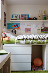
Today I wanted to share with you a few photos of my house that are featured in the new issue of an Icelandic magazine called Home. I was approached by them because of my book and they did a little interview to accompany the photos. (God knows how well it translated!) I'm never sure about having my house featured these days because it's not really the way I want it to look. It's just a mish-mash of bits I've picked up (ahem, on the street...) since we moved back to London and I am my own worst critic, of course. My style has changed in the past few years and I don't think my home is an accurate reflection of it. But oh well, that's life right? Most of us can't just go out and get everything we want when we want it right? And there are definitely more important things in life to worry about. So I present to you, my mish-mash, jumble of a rented home!
(Remember the story of this bed...?)
The room with the blue wall is technically the dining room and is connected to the one with the red butterfly cabinet and sofa. A lot of old Victorian terraced houses in London have the same set up: two rooms that were once divided by a wall, but are now one big room. As a result there are two doors that go from the hallway into this room. As much as it feels so, so wrong, we did what many people do and blocked one of the doors. If you don't, it makes it really hard to place a sofa!
Photography by the lovely Sarah Hogan.
For the full story and more photos, click here.


Hello Emily I think your home is fantastic! and you should be proud to show it. Love the colours and of course the way you put everything together!
ReplyDeleteThanks Sarah! Very sweet of you to say.
DeleteHey I recognise that house! You have made it look fantastic.
ReplyDeleteKaty (your landlady!)
Hi Katy! That's so funny. You must have got a surprise when you stumbled upon the photos. We love living in your house and of course, love the neighbourhood. I promise we're taking very good care of it!
Delete